


Valentine's day is over and the focus seems to be shifting from love to luck. The pinks and reds often associated with the holiday will soon be giving way to shades of spring color. Most notably, March seems to be filled with lots of green. St, Patrick's day is associated with both green and gold, so it always seems appropriate to choose it as the main color when I scrapbook March photos. This time around, I decided to challenge myself to create a monochromatic layout using green.
A monochromatic layout can definitely have a lot of impact. Color is a unique tool that can set tone for the page.Creating a layout with one predominant color can help you put the focus on your photos and story. It can also become a muddled mess. I have a few tips for how you can successfully pull off a magnificent monochromatic scrapbook layout.
Tips for Creating a Monochromatic Scrapbook Layout
1.Outline patterned papers or matte them to help keep the page from becoming too busy. Use ink or a marker to edge the papers. Or, as in the layout above, matte them with a piece of cardstock. I chose a cardstock matte in a shade of green just a bit darker than the base cardstock and the color in the patterned papers. You may also wish to matte your photos. The mattes or inked edges will help provide a subtle delineation between each layer of color.
2. Sometimes it is best to use a grid style design. If you find that you are losing the photos in a layer of patterned paper or if the design becomes to busy, fall back to using a grid design. The grid can be a little loose with the embellishments flowing outside of the boundaries.
3. Try to vary your patterns a bit or choose just one patterned paper print. I used a stripe, polka dot, geometric and hounds tooth print on my page. I could have also chosen just one print and filled a grid with it. Essentially, I am recommending you choose a set number of prints and stick with it. Pay attention the weight or scale of each patterned paper. If you are choosing 2 or more prints, you don't want them all to be the same size design.
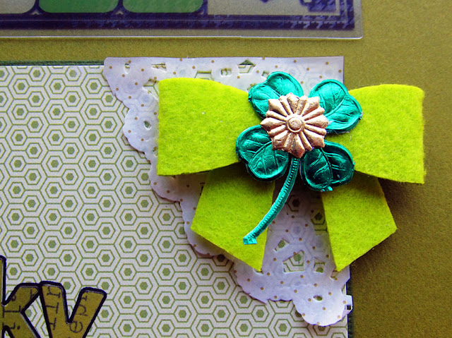

4.Use texture. Texture adds support for your story. Felt is soft and gives a sense of warmth. Lace is soft. Choose the right textures to set the mood for the page and to add visual interest.
5. Clearly define your focal point. I want to make sure my pictures don't get lost in a sea of green. I strategically placed 3 doilies to create a visual triangle around my photos.


6. It's ok to add a neutral color. Green is the predominant color on my scrapbook layout. I also used white and gold on the page to give the eyes a little break from all of that green.
7. Don't use just one shade of your chosen color. It is a lot more visually interesting to see all of the colors of green on the layout. Additionally, it would be difficult for me to find all of the same colors of green in my supplies. Don't stress about keeping things exact. Look more for motif, texture or pattern that might better contribute to the story.
Creating a monochromatic layout is a great way to use up supplies. You can easily make a kit by just choosing that single color from your stash of supplies. If you were to make a monochromatic scrapbook layout, what color would you choose?
Supplies Used:
Xyron Adhesive
Xyron Adhesive
Bazzill Cardstock
Sutdio Calico and Basic Grey Papers
Felt by Bella Blvd.
German Foil
Letters by American Crafts, Sassafrass and Basic Grey
Tag by PinkFresh Studio

No comments:
Post a Comment
Leave us some scrappy love!